Monochromatic Design: A Case for a Single Color Story
Few design decisions shape a space as quickly and dramatically as a single color story - aka monochromatic. There is just something undeniably compelling about going all in on one color.
And while monochromatic design is nothing new or groundbreaking (designers across every media type have relied on monochromatic design for decades), weddings and events traditionally tend to favor layered or complementary palettes over a single color story.
A few common assumptions about monochromatic design are: Monochromatic is too easy. Monochromatic means one color. Monochromatic is boring! Monochromatic is too modern.
But let’s dispel this! While monochromatic might not be for everyone, whether you lean minimalist or maximalist, a monochromatic palette executed well can transform an event in so many ways.
First, What Is Monochromatic Design?
A monochromatic color palette uses variations of a single color to create a unified visual experience.
The word itself comes from the Greek monos (one) and chroma (color), but in practice, monochromatic design is far from flat or one-dimensional.
Instead of relying on a single shade, designers work within a color family, layering:
Tints (a color mixed with white)
Shades (a color mixed with black)
Tones (a color softened with gray)
Within one color family, there can be remarkable range and nuance! Take green, for example. A single green palette could include sage, olive, moss, and deep forest tones.
Why Monochromatic Wedding & Event Design Works
1. Simplicity in the Design Process
Working within one color family simplifies decision-making. Rather than balancing multiple hues, the focus shifts to refining a single palette and exploring variation within it. This allows for more thoughtful, intentional design choices across every element.
2. Built-In Cohesion
Because every element participates in the same color story, monochromatic designs naturally feel harmonious. Florals, linens, rentals, and lighting all work together rather than competing for attention.
3. High Visual Impact
Limiting the color palette often increases the overall impact. Instead of acting as decoration, the color begins to define the environment itself. The result can feel immersive and even architectural.
4. Strong Emotional Atmosphere
Color plays a powerful role in how a space is experienced. Working within a single palette allows you to fully develop a specific mood, whether that’s soft and romantic, bold and dramatic, or modern and sculptural.
5. Ease of Scaling the Design
Monochromatic palettes make it easier to scale up design elements without creating visual chaos. Large installations, abundant florals, or layered tabletop details can feel expansive without overwhelming the space.
6. Elevated Attention to Detail
Without competing colors, the eye is drawn to form, texture, and material. Guests begin to notice little details like a sculptural floral stem, the drape of a linen, glow of candlelight, or texture of paper goods. These details are what make a design feel refined.
When Monochromatic Design Doesn’t Work
While powerful, monochromatic design is not a one-size-fits-all solution. Here’s how, without careful execution, a monochromatic design might fall flat:
There’s Limited Texture or Material Variation: If every element shares the same finish or material, the design can feel one-dimensional. Contrast in texture is essential.
The Scale Leans Too Minimal: When used too sparingly, a monochromatic concept can feel underdeveloped rather than intentional. Larger gestures and layered compositions help reinforce the design.
Poor Lighting: Lighting plays a critical role in showing tonal variation. If lighting is too harsh or flat, subtle differences between shades may disappear.
An Overly Narrow Palette: Repeating a single exact shade throughout the event can feel static. Depth comes from variation within the color family.
Lack of Alignment Across Design Elements: If elements like stationery, rentals, or fashion don’t align with the palette, the overall design can feel fragmented. Monochromatic design requires full participation.
3 Ways to Approach Monochromatic Wedding Design
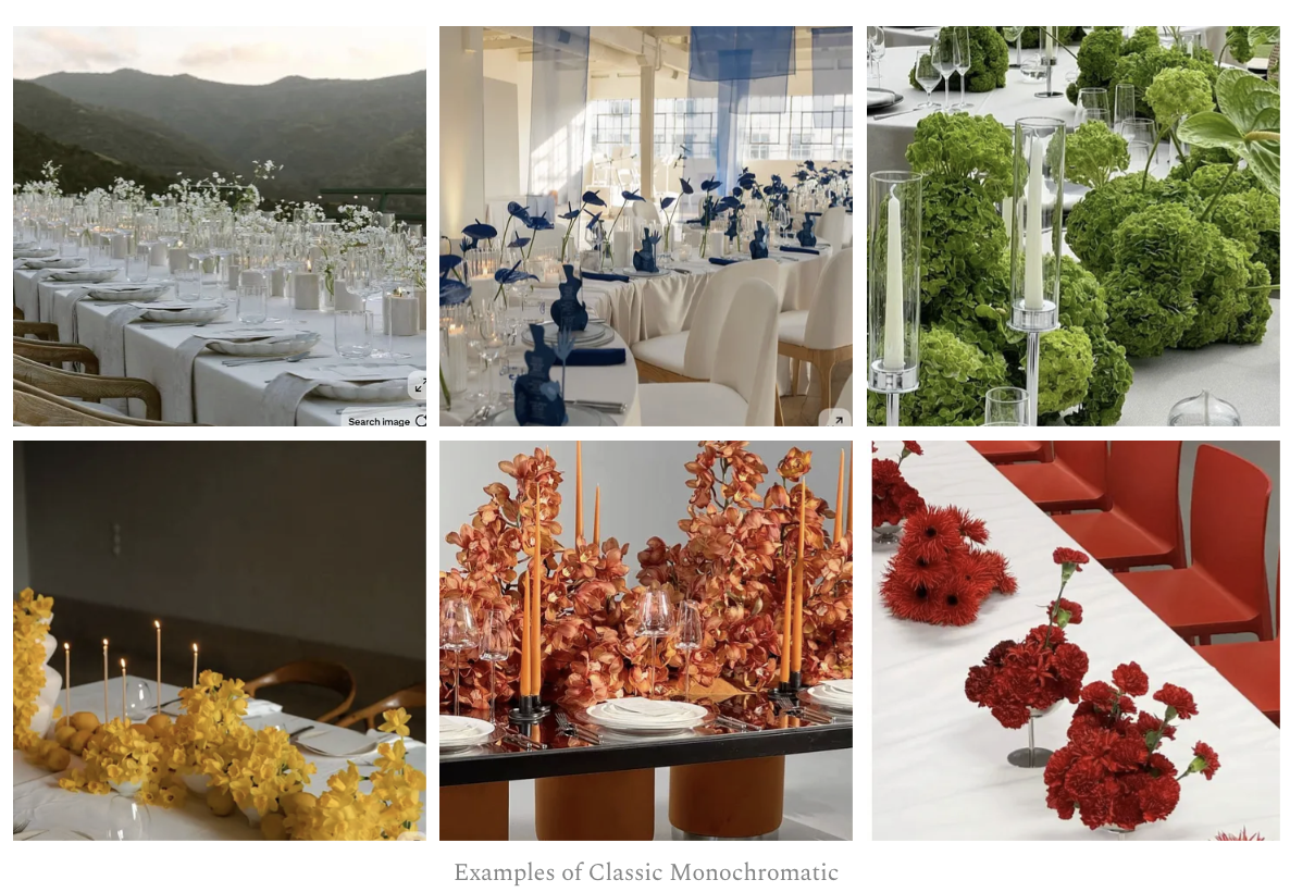
1. Classic Monochromatic
Classic monochromatic is a restrained approach using a single hue with minimal variation. The color is present but not (i.e. you don’t need to drape every surface in the color), resulting in a clean and disciplined aesthetic.
Achieving a truly “pure” monochromatic palette with flowers can be tricky due to natural variation, and this is where single-variety or mono-ingredient arrangements do really well!
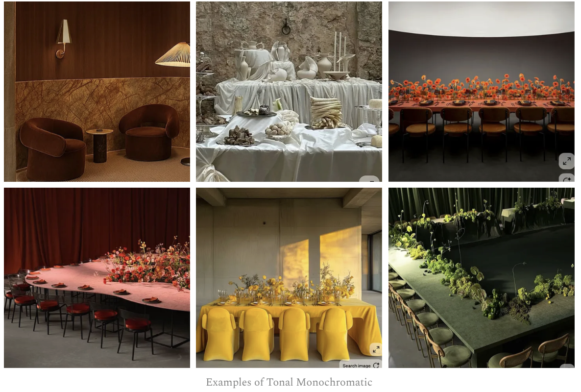
2. Tonal Monochromatic
A more layered approach, tonal monochromatic uses a range of tones within the same color family to create more depth while still maintaining cohesion. For example, lighter tones could come from the linens or draping, while deeper tones are in the florals or accents. In this post I do a deep-dive on tonal palettes.
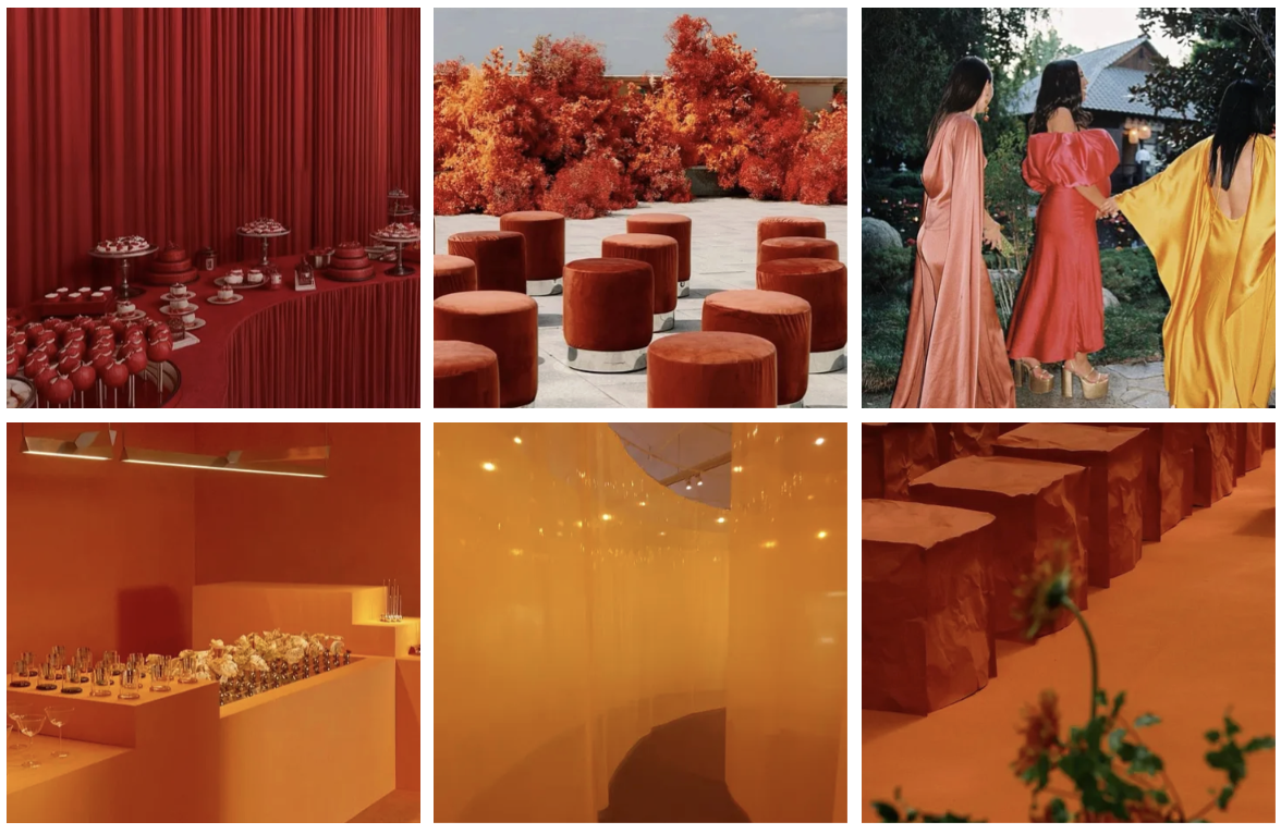
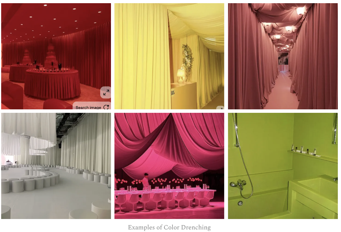
3. Color Drenching
Color drenching is a more maximalist approach that involves saturating every surface of a space in a single color. In interiors this might mean painting walls, trim, and ceiling in the same color. In event design this translates to draping, linens, furniture, flooring, florals, and lighting ALL within the same hue. It’s all-consuming.
And the result can feel very immersive, striking, and dramatic.
Creative Ways to Use Monochromatic Design in Weddings & Events
For those looking to push beyond traditional applications, monochromatic design can extend across multiple elements:
A floral palette progression across different parts of the event
Monochromatic food styling
Coordinated or tonal guest attire moments
Colored lighting and washes for ceilings and dance floors
A tonal cocktail bar or lounge design
Sculptural, single-ingredient floral installations
Monochromatic dance floors or ceremony ground coverings
Layered candle collections within one tone
Scent pairings that reinforce the palette (citrus, herbal, floral notes)
These details help create a fully immersive experience.
Is Monochromatic Wedding Design Right for You?
As mentioned, monochromatic design isn’t for everyone. But for couples and planners who are looking for a cohesive, design-forward approach, it offers a unique opportunity to create something that feels both refined and impactful. When executed well, it becomes more than a color choice but a foundation of the entire experience.
If you have a color story in mind, I’d love to help you bring it to life. → Inquire here . I’m currently booking 2026 and 2027 events.